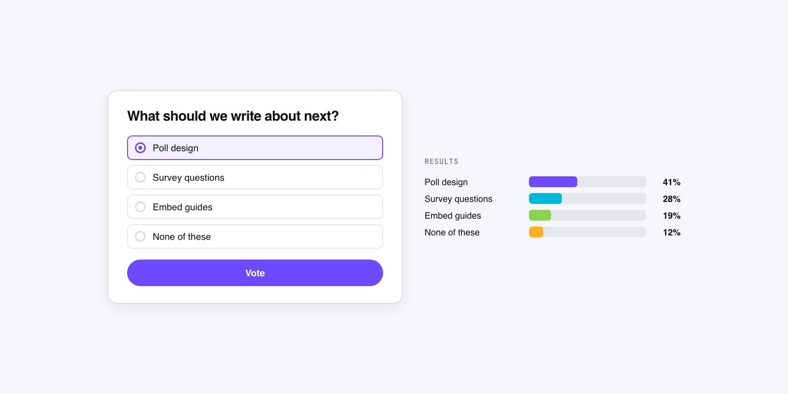
How to Create a Poll for Your Website
Most website polls fail for a boring reason: nobody answers them. They sit in a sidebar, ask something vague like “How are we doing?”, and collect four votes in a month. A good poll does the opposite. It asks one sharp question at the moment a reader actually has an opinion, and it gives back a result they want to see. Getting there is less about the tool and more about three decisions you make before you touch a tool at all.
Start with what you want to find out
Before anything else, finish this sentence: “I am asking this because I want to know ___.” If you can’t, the poll isn’t ready. A poll is a tiny research instrument, and a fuzzy purpose produces fuzzy answers you can’t use. And if the answer you need is big enough to take several questions, a poll may be the wrong shape for it; that’s the poll versus survey call, worth making before you build anything.
There’s a real split here. Some polls exist to learn something you’ll act on, like which feature to build next or which two article topics to write first. Others exist purely for engagement, a quick “which side are you on” that gives readers a reason to click and come back for the result. Both are fine. They just lead to different questions, so name which one you’re doing now. The action poll wants a question whose answer changes what you do. The engagement poll wants a question people enjoy having an opinion about.
Pick the poll type that fits the question
The format does a lot of quiet work. A single-choice poll, where a reader picks exactly one option, forces a decision and gives you clean, easy-to-read results. Reach for it by default. Multiple-choice, where people can tick several boxes, is for genuinely additive questions (“Which of these do you use?”), but the percentages stop summing to a tidy 100 and get harder to explain.
Keep the option count honest. Two to five choices is the sweet spot for a website poll. Once you’re past six, people skim, pick the first thing that’s close enough, and your data tilts toward whatever sits at the top. If you genuinely need a long list, that’s usually a sign the question is doing too much and should be split. The deeper questions of single versus multiple choice and how many options to offer each get their own walkthrough, but the rule of thumb above will carry you most of the time.
Write the question like you’re saying it out loud
This is where polls live or die. Read your question aloud. If it sounds like a survey from a bank, rewrite it. “To what extent would you consider utilizing our content offerings?” is a question no human answers. “What should we write about next?” is.
Watch for the leading question, the most common own-goal. “How much did you love the redesign?” assumes the answer and poisons the data. “What do you think of the redesign?” with honest options, including a negative one, gives you something real. Make the answer options mirror the way people actually talk, keep them roughly the same length so one doesn’t look like the “right” pick, and always give an out: a “None of these” or “Not sure” so people who don’t fit your list don’t either bail or lie. Good question-writing is a whole craft on its own, but those few habits remove most of the damage.
Build it
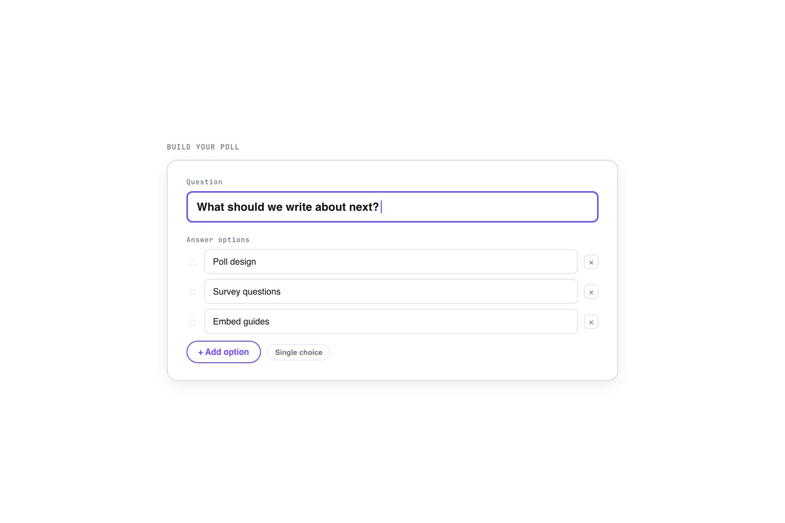
Now the easy part. You can build a poll right here on GFX Poll Studio: type the question, add your options, pick a style, and you’ve got a working poll in under a minute. The same shape applies whatever you use. Enter the question, enter the options, choose single or multiple choice, and set whether results show right after someone votes or stay hidden until they do. Showing results immediately rewards the voter and tends to lift participation. Hiding them until a vote is cast nudges fence-sitters to commit.
One setting people forget: what happens to a repeat visitor. A poll that lets the same person vote ten times is a poll whose results mean nothing. Basic one-vote handling, by browser or session, is enough for a website poll. You’re not running an election, you’re taking a temperature, but you still want each reader counted once.
Get it onto your page
A poll only works where readers already are. The two normal paths are an embed snippet, a small block of code you paste into a post or a widget area, or a native option if your platform has one. On WordPress that might be a block or a shortcode; on most other sites it’s the embed code. Either way the poll should load fast and sit at full width inside your content, not crammed into a narrow sidebar where it gets ignored.
Placement matters more than people expect. A poll dropped at the end of a relevant article, while the topic is fresh in the reader’s head, beats the same poll stranded on the homepage. Put the question where the reader just finished thinking about it. The mechanics of embedding cleanly across different platforms get their own guide, but the principle is simple: meet readers in context, not in a leftover corner of the layout.
Read the results without fooling yourself
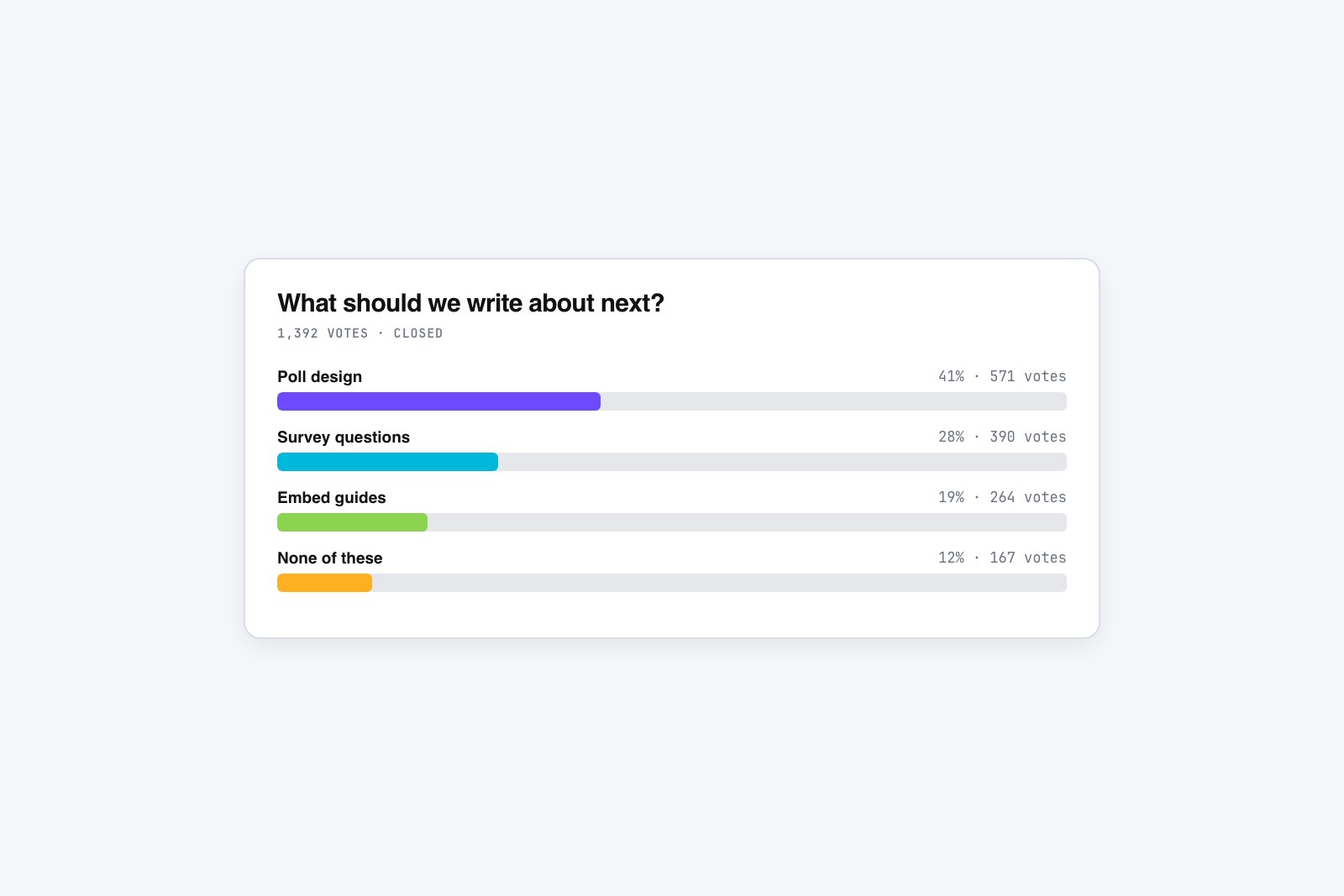
Results come in and the temptation is to treat them as truth. Resist it a little. A website poll samples the people who happened to visit and felt like clicking, which is not the same as your whole audience. Twelve votes is a vibe, not a finding. A few hundred starts to mean something.
Look past the winning bar, too. The shape of the whole result often says more than the top choice. A near-even split tells you the question is genuinely contested, which is interesting in itself. A landslide usually means the question was easy or the options were lopsided. And if “None of these” is winning, your options missed the real answer, which is the most useful failure a poll can hand you. Note what you learned, change one thing, and ask again. A poll you run, read, and rerun teaches you more than a perfect one you set up once and forget.