How to Design a Quiz That People Actually Finish
Quiz makers love to brag about how many people started their quiz. That number lies. A quiz that opens strong and then loses three-quarters of its takers by question eight isn’t a good quiz, it’s a leaky one, and the start count hides the leak. The number that actually matters is completion: how many people reach the result screen. Almost everything about designing a quiz that works comes down to finding the places where people quietly give up, and closing them.
Count finishers, not starters
People bail on a quiz for four ordinary reasons, and none of them is that your topic was boring. It ran too long. It gave no sense of how much was left. It opened with a dull question that made them regret clicking. Or they could tell the result at the end wouldn’t be worth the effort. That’s the whole list. Each one is a design decision you can change, not a flaw in your idea, which is good news because it means quiz completion is something you build, not something you hope for.
So stop watching starts. Watch where the line drops. If half your takers vanish on question two, the problem is question two, not your promotion. Read the shape of the fall-off the same way you’d read the shape of poll results, and fix the questions in the order people abandon them.
Make it shorter than you think
Whatever number of questions you have in mind, cut it. The instinct is always to add “one more” because each question feels harmless on its own, but takers feel the total weight, not the individual click. A personality quiz lands best at six to eight questions. A knowledge or trivia quiz can stretch to ten before it starts to feel like homework. Past that, you’re spending goodwill you’ll want for the result.
Picture a food blog running “What kind of home cook are you?” with fifteen questions covering knives, pantry staples, weeknight habits, and dream kitchens. Almost nobody reaches the verdict. Trimmed to seven sharp questions that each split people cleanly, the same quiz gets finished and shared. If you want to sketch the flow before committing to a build, you can rough out the question-and-answer skeleton on GFX Poll Studio and read it back as a taker would. Length is the easiest thing to overshoot and the easiest to fix.
Show how close the finish is
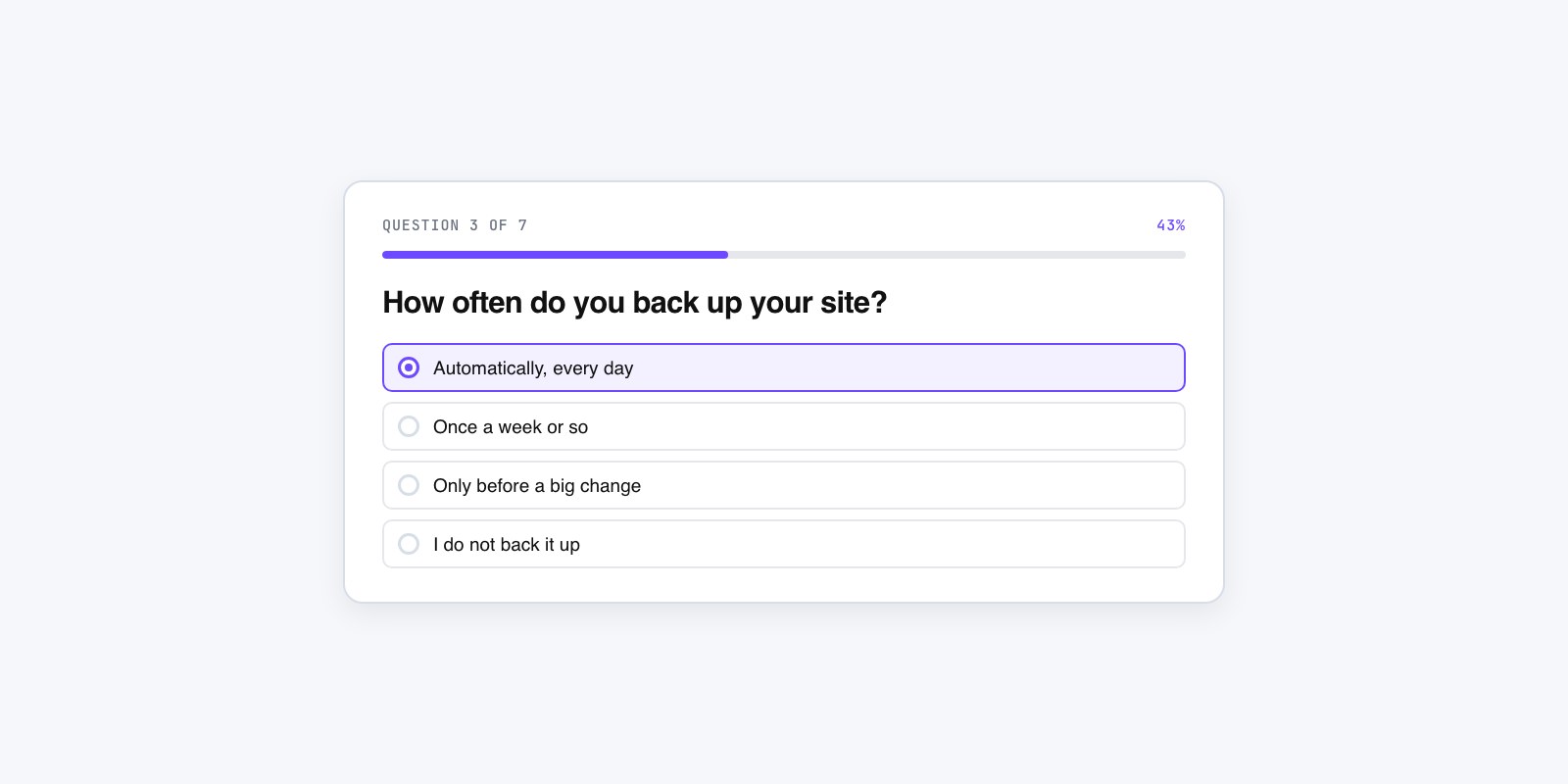
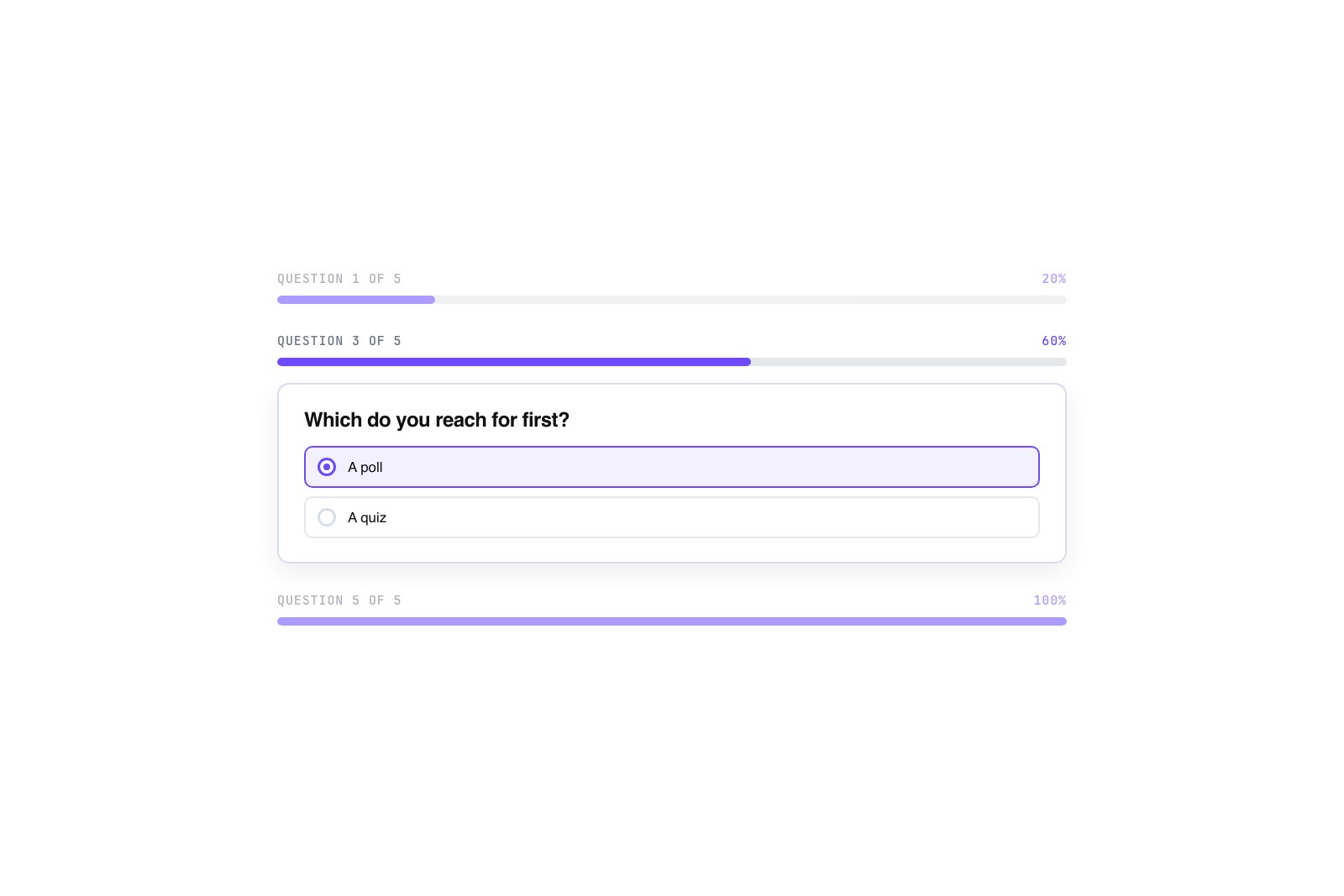
A quiz with no progress indicator feels bottomless. People will answer three questions, have no idea whether they’re a quarter or three-quarters done, and quit rather than commit to an unknown. Show the end. A simple “Question 3 of 7,” a filling progress bar, or a row of dots that light up as they go all do the same job: they turn a vague slog into a countable, finishable task.
There’s a bonus. A short number is its own advertisement. “Question 2 of 6” quietly promises the taker this won’t eat their afternoon, which makes them more willing to keep going than a bare “Next” button ever could. This is one of those design habits that carries across formats, part of the wider poll design best practices that make any interactive piece easier to say yes to. If your platform can only show a step counter, use that. Any visible progress beats none.
Open with the easy, fun one
The first question sets the entire tone, so never make it the hard one. Two mistakes kill quizzes on the first screen: leading with a demanding trivia question that makes people feel dumb, and asking for an email before they’ve answered anything at all. Both say “this is going to be work” at the exact moment you needed to say “this is going to be fun.”
Front-load an easy, playful question that lets people answer instantly and enjoy it. A music blog’s decade quiz should open with something anyone can guess, like “Which of these bands came first?” with obvious options, not a deep-cut question about a B-side. Then order the rest easy to harder, so difficulty ramps up only after someone is invested. By the time the tricky question arrives, they’ve already answered five and want to see how they did. That easy opener is the same instinct behind the website poll examples that pull far more responses than others: give people a low-effort first move and momentum does the rest.
Make the result worth the effort
Everything above only pays off if the ending is good, because people are answering questions in exchange for a payoff, and they can smell a weak one coming. A result that just says “You scored 6 out of 10” is a dead end. A result people want gives them something to carry away: an outcome they’d screenshot, or advice they can actually use.
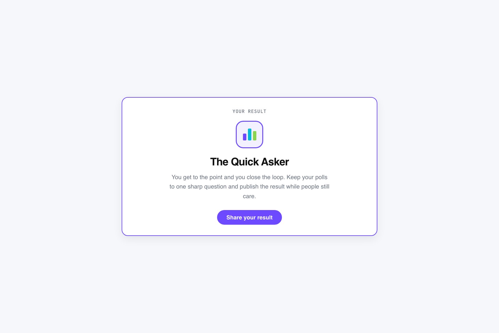
For a personality quiz, that’s a named result with a little character to it, a “You’re the Improviser in the kitchen” card with a one-line description that feels specific enough to share. For a SaaS onboarding quiz, it’s a recommendation: “Based on your answers, the Growth plan fits you, here’s why,” which turns an interactive quiz into a genuinely helpful step. A shareable result also does more to increase engagement with your polls and quizzes than any amount of promotion, because every finisher who posts their outcome brings the next batch of takers with them. Design the result first, then build the questions that earn it. A quiz people finish is really just a quiz whose ending was worth walking toward.