Poll Design Best Practices for a Higher Vote Rate
A reader decides whether to answer your poll in about half a second, before taking in a single word of the actual question. That snap judgment is pure design: the eye lands, sizes up whether this looks quick or fussy, and either commits or scrolls past. Poll design is not decoration. Every choice below serves one number, the share of people who actually vote, and none of them are about making the poll pretty.
Make it readable in one glance
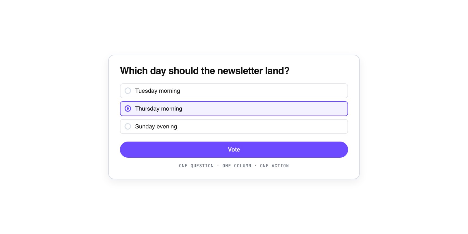
The first job of a layout is to be understood without effort. A reader should take a poll in like a road sign, not a form. That means the question sits on top in plain, readable type, the options stack in one clear column, and nothing else competes for attention around them. When a poll carries a heavy border, a busy background, three font sizes, and a share icon crowding the corner, the eye has to hunt for where to click. Hunting is exactly what kills a casual vote.
Keep the options in a single vertical list rather than a two-column grid. One column reads top to bottom the way people already scan, and it stops the accidental pairing your brain does when options sit side by side. Give each option enough room that it reads as its own tappable thing. If your four options wrap to two lines each and stack with no space between them, they blur into a paragraph, and a paragraph does not look like something you click. A forum moderator running a quick “which night for the next meetup” poll wins or loses right here, before the wording even matters.
Let color carry meaning, not decoration
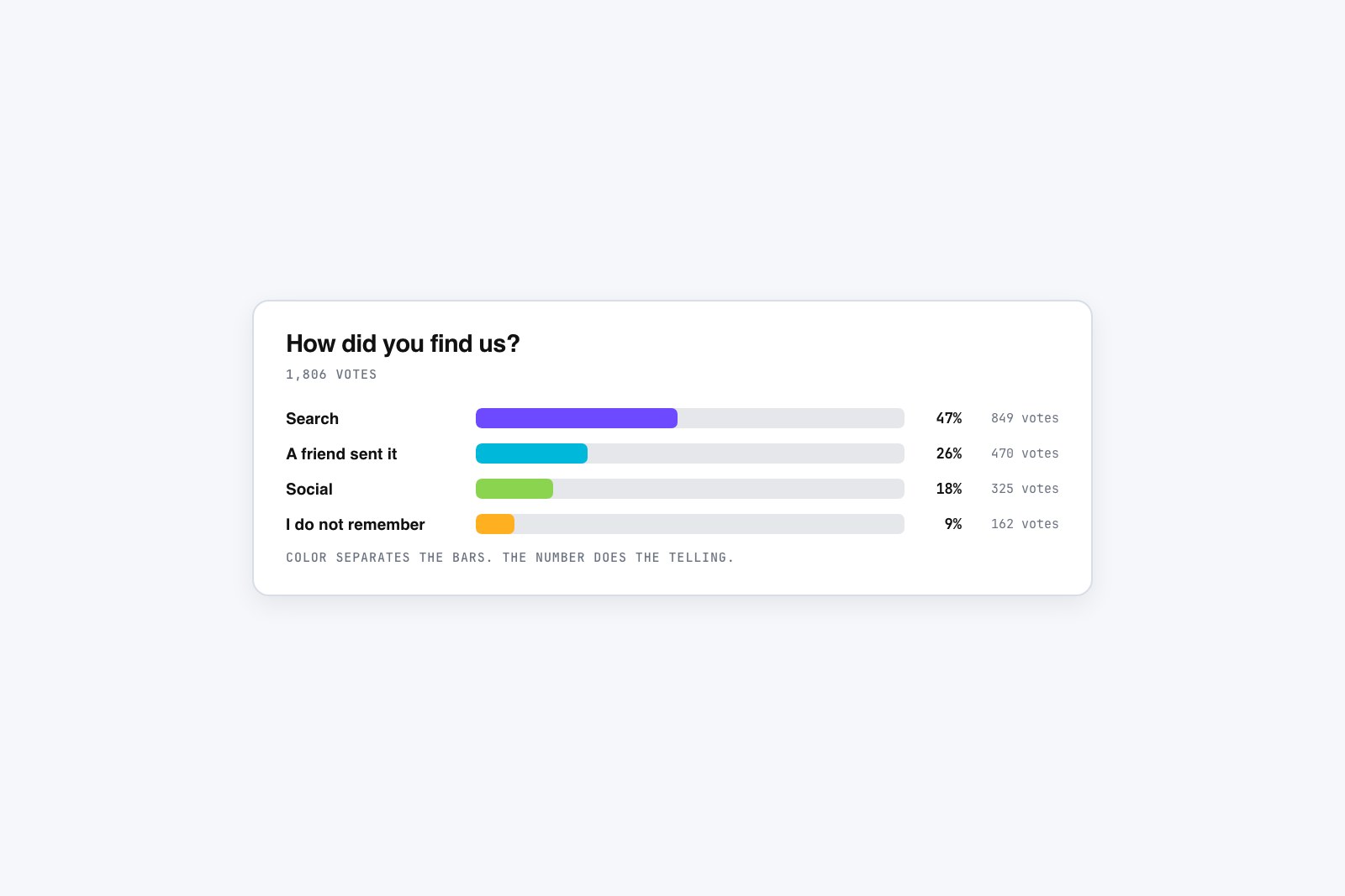
Color is the most abused part of poll design. The instinct is to match the brand, so every option gets the same accent and the whole card turns into a wash of one hue. That wastes the one thing color is genuinely good at: showing quantity. Save your strong color for the result bars, where a longer, filled bar instantly reads as “more votes.” That is color doing real work, encoding data the eye can read before the numbers register.
Everywhere else, go quiet. The question, the option labels, the card, and the button all read better in restrained neutrals, with a single accent held back for the one thing you want tapped. A recipe blogger who paints all four answer options in four brand shades has built a decoration. A poll that keeps the options plain and lets the result bars carry the color has built an instrument. When color means something, readers trust it. When it is just paint, they tune it out, and then it cannot help them read the result either. A ready tool like the GFX Poll Studio creator leans this way by default, keeping options quiet and reserving color for the bars, but the principle holds whatever you build with.
Never let color be the only signal
Here is the rule that matters most, and the one most polls get wrong: never let color alone carry the result. Every result bar needs its number in plain text right beside it, both the percentage and the raw count. “62% (48 votes)” next to the bar, not just a longer green rectangle the reader has to eyeball against a shorter grey one.
This is not a nicety. It is the difference between a poll that works for everyone and one that quietly shuts people out. Roughly one in twelve men has some form of color blindness, and to many of them a green “winner” bar and a red “runner-up” bar look nearly the same. If the only way to tell which option won is the color, those readers cannot read your result at all. The same failure hits anyone squinting at a dim phone in sunlight, or anyone who keeps their brightness turned down. Put the number in text and the problem disappears for all of them at once. It even helps people with perfect vision, because nobody actually enjoys guessing percentages from bar length. Say what the bar means in words, and let the color be the fast, pleasant confirmation, never the sole source of truth.
Make it easy to tap and fast to load
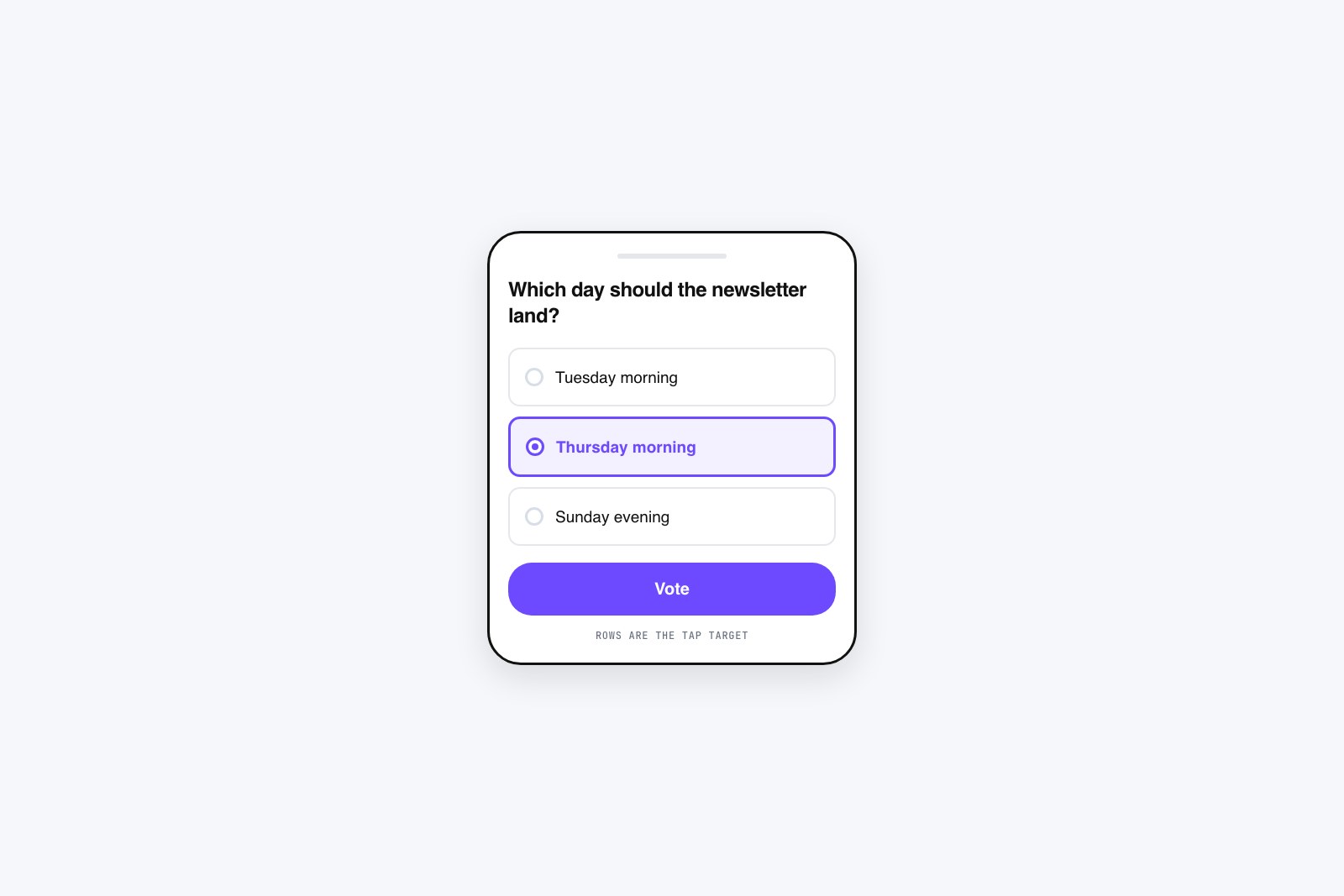
Most of your votes will come from a phone, so design the poll for a thumb first. Each option needs to be a big, forgiving target, with the whole row tappable, not just a tiny radio dot the size of a grain of rice. If a reader has to aim, some share of them miss, shrug, and keep scrolling. A comfortable touch target is about the size of a fingertip, and generous padding around each option is what gets you there. Spacing between options matters too, so a thumb aimed at “Option 2” does not land on “Option 1” and log a vote the reader never meant to cast.
Speed is part of design even though you cannot see it. A poll that loads a heavy script, pulls in a web font, and shifts the layout while it settles has already lost the reader who was mid-scroll. Keep it light. The poll should appear fast, sit at full width in the flow of the content, and hold still as it loads instead of jumping around. It also has to appear in the right place, since a poll stranded far from the topic it belongs to gets skipped no matter how clean it looks; that is its own decision, covered in the guide on where to put polls on your page. A poll that arrives a beat too late, after the eye has moved on, gets no vote at all.
Do not bury the vote button
The most common self-inflicted wound is hiding the action. The vote button should be the most obvious thing on the card after the question, one clear button in your one accent color, not a faint grey link tucked under the options. If a reader has picked an answer and cannot instantly see how to submit it, you have lost a vote you had already won. Same goes for any “view results” link. It belongs after voting, not as a competing button that lets people skip straight past the thing you wanted them to do.
All of this comes back to one test. Look at your finished poll and ask what the eye lands on first, second, third. It should be the question, then the options, then the button, in that order, with nothing decorative jumping the line. To see how these choices play out on live pages, the rundown of website poll examples that get more responses lays the patterns out side by side, and the same reads-in-one-glance thinking scales up when you design a quiz people actually finish. Treat design as clearing a path to the vote, because clearing that path is the only thing the design is for.